What does your email signature say about you?
Is it simple, informative, and professional?
Maybe you haven’t put much thought into it, but your email signature influences each contact’s perception of you.
Whether you’re sending cold emails, corresponding with potential investors, or offering support to your customers, your email signature is attached to every email you send. It only makes sense to put effort into designing the perfect signature.
This article will cover what you should include in your email signature, design tips, how to generate your own signature, and provide the resources you need to get your signature set up and properly formatted in your email client.
What to Include in Your Professional Email Signature
1. Basic Contact Information
First and foremost, your signature should provide information about you, such as your name, your business name, and your position title.
You can also include other ways you can be contacted, like your phone number or professional social media profiles.
Rather than just linking to different social profiles, use social media icons to save space and drive traffic. Choose a set of icons that matches the rest of your email signature. Here’s a list of 49 sites to find free icons so you can find one that suits your brand aesthetic perfectly.
2. An Image or Logo
As long as you keep the image file small, a logo or a headshot are a great way to personalize your signature. Just make sure it fits in with the rest of your signature’s aesthetic and limit yourself to two images or graphics max.

3. Promote Fresh Blog Content or Your New E-Book
If you’ve got a new blog post, e-book, or video you want the world to see, update your email signature to include a link to it. Not only does this demonstrate your expertise and build credibility in the eyes of the recipient, it helps drive traffic to your awesome content.

3. A Simple Call-to-Action
An alternative to promoting a specific piece of content is to include a call-to-action. This could be anything from inviting recipients to visit your blog, schedule a demo, register for an upcoming event or webinar, enter a contest, take a poll, or download a piece of content.

4. A “Sent from my iPhone” Disclaimer
You can also play around with a “Sent from my iPhone” disclaimer. Not surprisingly, correct spelling and grammar increase your credibility. So, if you tend to type out quick responses on the go, including some variation of this line can make recipients more forgiving of errors.
What NOT to Include in Your Email Signature
Here are some other things you should leave out of your email signature:
Design Tips for a Better Email Signature
Now that you know what to include in your signature, follow these design tips to ensure your signature makes the best impression possible.
Less is More
The perfect email signature conveys your contact information in a simple, clean, visually-appealing format.
Rather than listing every possible way someone can reach you, select a few specific methods of contact to include. This keeps it concise and tells people how you prefer to be contacted.
Two or three lines is ideal – four max if you want to include your business address or phone number.
Don’t Make Your Entire Signature an Image
Feel free to include an image in your signature – like a brand logo or a photo of yourself – but don’t even think about making your entire signature an image. It might not always display properly and your recipient can’t copy your contact details if they’re part of an image.
Be Deliberate in Your Use of Color
Use too many different colors and you risk creating a cluttered, clashing sign-off. Instead, choose a few specific colors from your logo to highlight elements of your signature. This ties your whole signature together in connection with your brand.
Stick to a Single Font or Two
As with colors, using too many fonts is distracting, difficult to read, and makes your email look unprofessional.
If you want to draw attention to a specific aspect of your signature, like your name or phone number, play around with font size, weight, and color. This adds emphasis without the use of multiple font styles.
Make the Best Use of Space Possible
Create a design hierarchy to draw attention to the most important information first. You can achieve this by adjusting the font (size, weight, and color), alignment, and positioning of all elements including images. Left alignment is the safest bet for easy reading, since our eye is used to scanning from left to right.
You can also use dividers to help organize data and define your information hierarchy. For example, a vertical bar or “pipe” helps divide up different pieces of information while keeping your signature clean and organized.
For example: Emily Bauer | Content Marketing | Propeller CRM
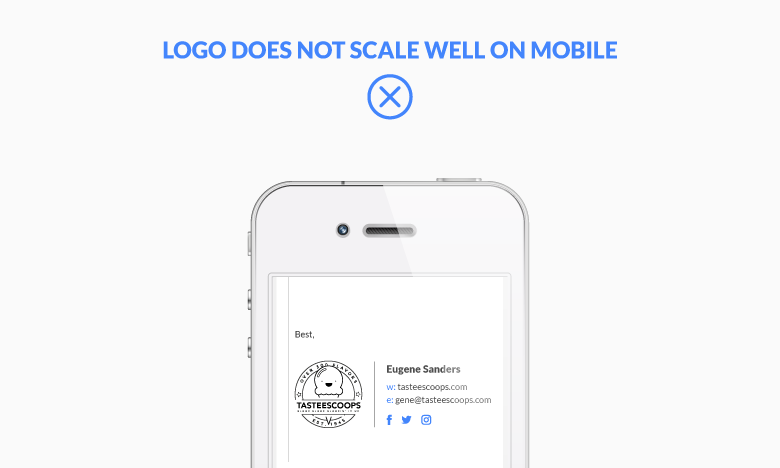
Design with Mobile in Mind

Did you know that 54% of email is opened on a mobile device? That means over half of all email recipients are unable to read email signatures that aren’t designed to scale on mobile.
Since mobile screens are much smaller than computers, choose type and graphics that remain legible when scaled down significantly. Make sure any buttons you include (like social media icons) are easy to tap – which means leaving some white space in between them.
How to Generate an Email Signature of Your Own
If you’re ready to create your own signature, check out Hubspot’s super handy (and free!) email signature template generator. Simply enter your information into the form and the tool will turn it into a ready-to-use signature that you can export and add to your email client.
Or try out one of these free alternatives:
Getting Your Signature Set Up with Your Email Client
Now that you’ve got the tools to design the perfect modern email signature, the next challenge is setting it up in your email client. It can be tricky to make your signature look exactly how you want it to, but here are some resources to make it easier.
Gmail
This helpful tutorial tells you how to manually create or change a gmail signature on your computer, android device, iPhone, or iPad.
iPhone & iPad
There are a few different articles available on setting up your email signature on iPhone and iPad, including this one, which was tested with iPhone Mail 6, iOS Mail 9, and iOS Mail 10.
Mail for Mac
This tutorial walks you through how to set up and preview your email signature for Mail.
Outlook
Here’s a detailed overview on how to create and personalize your email signature in Outlook 2016 and Outlook 2017. If you’re still using an older version, here’s the guide for Outlook 2010 and 2007.
Samsung Email App
If you’re sending emails from your Samsung Galaxy S7 or S7 Edge, follow these simple directions to set up your email signature.
Yahoo! Mail
Here’s where you can find instructions to edit or update your Yahoo! email signature.


